Take a quick look at your wardrobe, home décor, or accessories and chances are you notice a pattern. If you’re like most people, you tend to gravitate toward certain colors and shades, even unconsciously! That’s because color is more than just something that makes life a little bit more interesting and brighter. Colors pack a serious psychological punch.
Color psychology is a discipline within psychology that studies how colors affect human mood, behavior, and emotions. Their findings are used by a variety of industries to help soothe, energize, or inspire people around the globe. Designers and marketers rely heavily on color psychology when building a brand, and that includes fleet graphics. Keep reading to learn how you can harness the power of psychology in your next fleet graphic design.
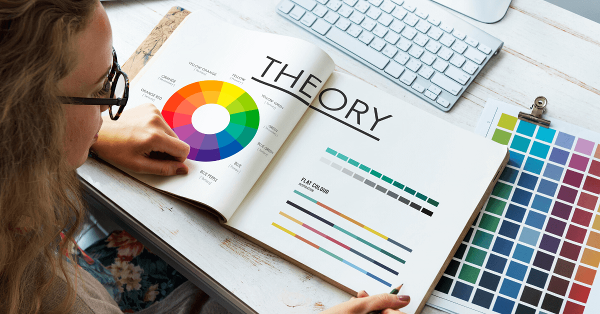
Colors and What They Represent
Cultures have long used colors to symbolize ideas and evoke certain emotions in the viewer. Modern viewers are no different. Colors can still communicate an entire mood and personality with just a glance. It’s one of the most powerful tools in your toolbox when it comes to creating a distinctive identity for your brand and fleet graphics.
While you may instinctively know what some of these colors represent, we’ve put together a handy cheat sheet to help you navigate the world of color psychology.
- Red communicates energy, excitement passion, speed, efficiency. It’s also been shown to stimulate appetite and act as a powerful attention grabber
- Blue is all about calmness, trust, stability, reliability, dependability, purity, and cleanliness. Think of the refreshing, cooling nature of the ocean or sky and you’ll understand blue.
- Green brings us back to nature, freshness, and health. Use green to communicate balance, harmony, relaxation, and rejuvenation.
- Orange is great for conveying enthusiasm, warmth, excitement, friendliness, and approachability. Like red, it can stimulate appetite. On the other end of the emotional spectrum, it’s also a color often used to warn people of hazards.
- Yellow communicates happiness, optimism, energy, joy, warmth, and is uplifting. Like red and orange, it can stimulate appetite and also be used for warning, and creating visibility.
- Purple is associated with royalty, luxury, creativity, sophistication, indulgence. Often used by premium or gourmet brands darker shades to evoke elegance, uniqueness
- White brings to mind bright clouds and lovely flowers. It’s pure, simple, clean, innocent, and minimal.
- Gray is a great choice if you’re looking for neutrality, balance, professionalism, sophistication, and modernity. With gray you’ll show a no-nonsense approach, seriousness, and efficiency.
- Black is powerful, authoritative, professional. Use black to convey elegance, strength, and sophistication. It’s the perfect choice for high-end, luxury products.
How To Leverage Color for Your Industry
Now that you have a feel for the power of each color, it’s time to break them down according to industry. Of course, you can choose whatever color you like for your brand—sometimes disruption is good! However, keep in mind that color is the fastest shortcut to communicating a lot of information in the shortest amount of time. With the right colors, potential patrons can get an immediate sense of what your brand is about and be invited to learn more.
- Food: Thanks to their proven ability to stimulate appetite warm colors like red, orange, and yellow are strong choices for brands in the food industry. Alternatively, if you run a health food business, you may consider green to convey vibrance and well-being.
- Beverage: Bright warm colors are also a popular choice for beverage companies, conveying a sense of energy and fun. Keep in mind that many water companies opt for blue or green to evoke a sense of nature and hydration.
- Logistics / Freight: Logistics and freight companies need to build trust immediately. Reach for blue or gray to capitalize on a sense of trustworthiness or professionalism. Alternatively, you might find success with red or orange to convey a sense of energy, intelligence, and speediness.
- Healthcare Vehicles: Blue is a leading color in healthcare as it’s prized for its ability to evoke a sense of calm and trust. Green is also popular choice as it is commonly associated with health and wellness. If you’re looking to stand out from the crowd, you might choose purple as it has been linked with compassion.
- Utility Vehicles: Tasked with providing the public with electricity, gas, and water, these trusty vehicles are often branded in power colors like red, orange, and black to show energy and professionalism.
- Emergency Vehicles: When we think of emergency vehicles, we often associate them with white, the color of purity and simplicity. It gives viewers a sense that safe and trustworthy help is on the way. However, recent studies have suggested that the best color for emergency vehicles is an eye-popping lime-yellow to help with visibility day and night.
- Municipality Vehicles: These vehicles should align with the branding of the municipality they serve. Many utility trucks are white because it serves as a perfect canvas to display the municipality logo and contact info.
- Universities: The most popular color combination for universities is red and white, but branding for universities can come in a variety of colors. Typically, universities stick to two or three main colors that are immediately recognizable to their students, alumni, donors, and prospective students.
Contact Signature Graphics for Your Perfect Design
If you’re looking to maximize the impact of your fleet graphics, choosing your colors carefully can go a long way. At Signature Graphics, our creative team has a passion to produce exceptional designs and a track record of happy clients. If you’d like help sorting through your choices of shades and hues to find your perfect brand color fit, get in touch! Our expert designers are standing by to help you harness the power of color psychology in your fleet graphics.
We proudly use 3MTM graphic films and overlaminates.