The effect of color on people’s emotions has been a topic of study for centuries. In the modern era, the thoughtful use of color in product packaging, logo, and advertising is an essential part of branding and marketing.
Effective Use of Color Can Boost Sales
Fleet graphics are increasingly useful in advertising, as commute times in cities have steadily been on the increase. While people instinctively learn to block out the constant influx of advertisements online and in print, product marketing along roadways and in pedestrian areas becomes a more useful tool.
Eye-catching, colorful compositions will help you to establish brand recognition and increase sales. The use of color psychology to project a desired mood is a tool that has been proven to be effective for decades.
What Mood Are You Trying To Project In Your Ads?
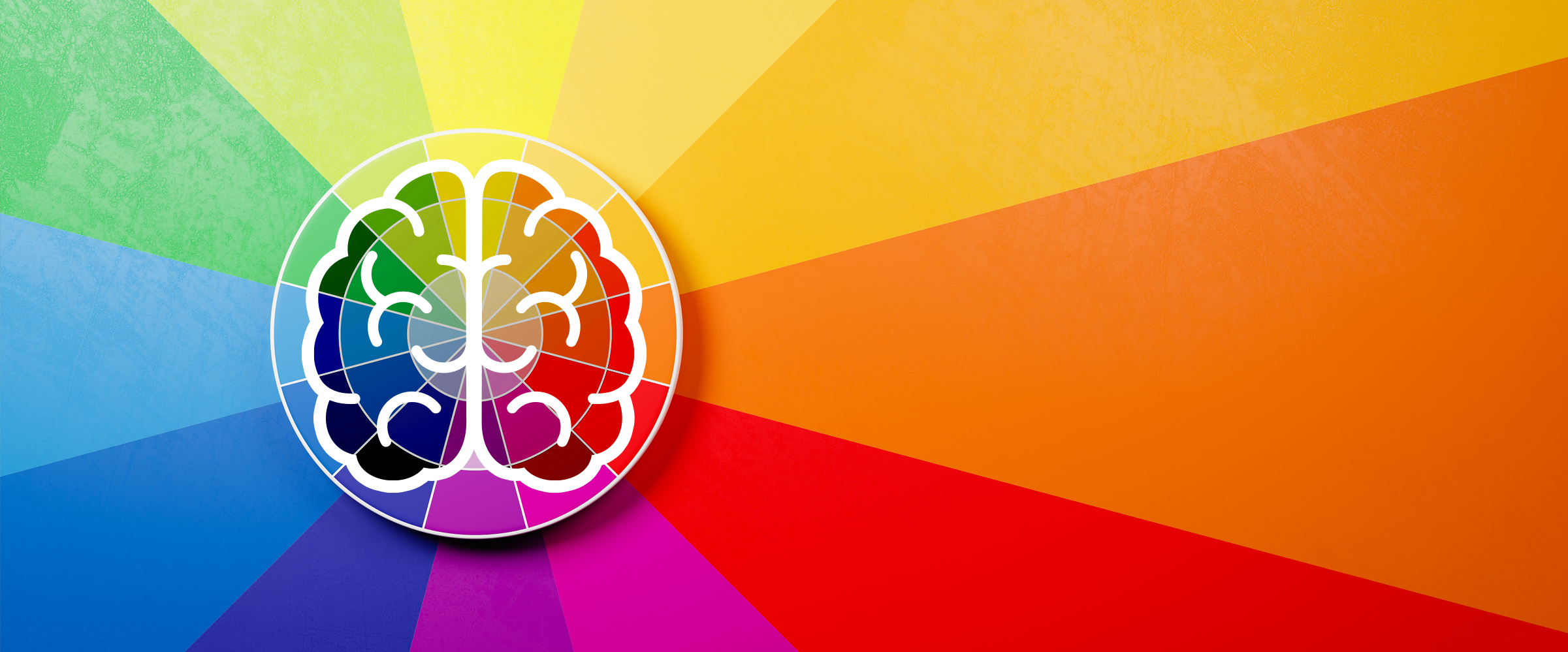
Many studies have linked how certain colors affect people’s moods and buying habits. An estimated 62-90% of a human’s decision making and assessment of a viewed object is based upon just the color of the object.
Color can be used to reach specific target demographics, as the perception of color can be affected by age, gender, and cultural differences. Our Design and Print Service can work closely with you to make the most eye-catching Fleet Graphics for your business and project the desired mood to your potential customers.
How can certain dominant color choices affect the desired response in the design of your Fleet Graphics? Here are a few examples:
Red: Proven to stimulate the central nervous system and increase appetite, red has such a profound effect on exciting the viewer that clinical environments rarely employ the use of red or it’s analogous colors (yellow and orange) to prevent patients from becoming agitated or having increased blood pressure. This color is a natural choice for injecting an element of excitement into your advertising. Red has a positive effect on stimulating impulse shoppers.
Blue: Blue is firmly linked to feelings of calm. In advertising, the perception of blue being stable and reliable makes it a popular choice for corporate logo design. Royal blue is known to be attractive to impulse shoppers. Studies have shown that blue, one of nature’s favorite colors for mold, is an appetite suppressant. It is a rare color in natural foods (blueberries being one exception) and a poor color choice for convenience foods.
Yellow: Known to increase appetite and improve overall mood. Yellow is an attention grabber and projects confidence. It is used by food manufacturers to convey that consuming or buying a product will produce feelings of happiness. However, yellow can cause eye strain when used in advertisements and is also linked with feelings of frustration and anger.
Green: Often positively linked with a healthy environment, plants, and nature, green can sometimes give the consumer the impression that a product or service is “expensive”, so this can produce a negative or positive result, depending on what the target demographic is.
Violet: The traditional color of royalty; in ancient Rome, only the wealthy and royalty could afford to buy purple dye: the manufacture of which required huge numbers of rare sea snails to procure enough pigment to make a tiny amount. People still associate purple with quality or wealth. Purple is also associated with spirituality in western, eastern, and new age religions.
Ready to dazzle your potential new customers with colorful, engaging and targeted visuals? Request a quote from us today to further explore the growing media of Fleet and Specialty Graphics.
We proudly use 3MTM graphic films and overlaminates.
