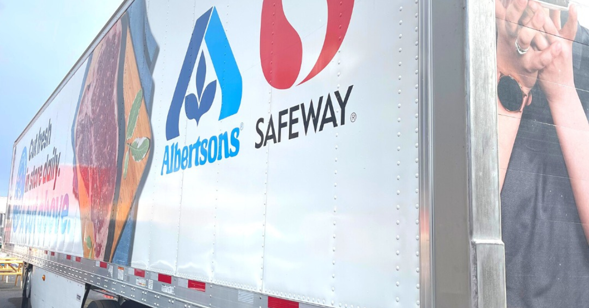
Imagine this: You’ve invested time, energy, and funds into wrapping your fleet with graphics. Your vehicles are traveling down highways and passing hundreds of potential customers in a single journey. But the vehicles aren’t generating the leads you expected. Why? Because your fleet graphic design isn’t working at high speeds!
Are Your Fleet Graphics Being Seen at Highway Speeds?
Fleet graphics are mobile billboards—in fact, studies indicate that they’re on the move up to 50% of the time. If you don’t factor in the speeds at which potential customers pass your message, you could be missing opportunities.
For stationary signs, ADA Guidelines recommend 3-inch lettering for signs viewed from 25 feet away and 6-inch lettering for distances of 35 feet or more. This formula changes when you factor in the movement of the viewer. The USSC (United States Sign Council) uses a formula to determine the optimum signage square footage required for a sign to be seen by moving cars. “VRT (viewer reaction time) + MPH/800 = recommended square footage for a stationary sign. This will vary by road complexity.” But what if the buying public and the sign are both moving?
How to Design Fleet Graphics for High Speeds
“The best way to design Fleet Graphics for high speeds is to grab the attention of your viewer as quickly as possible,” says Signature Graphics veteran designer, Carrie Flores. “A good design keeps things simple and immediately draws attention to essential information.”
According to 3M, the average potential customer will view your graphics for 3-5 seconds. Follow these designer-approved best practices to design the most effective fleet graphics.
- Use large, clean font and bright, eye-catching colors.
- Highlight your business name and website. Many designers have moved away from including phone numbers on designs as most consumers will look your website up before calling.
- Use very short, memorable taglines that tell your customers about your product or service.
- Utilize the back of your vehicle for additional information. Drivers have more time to digest your message when they follow behind a member of your fleet.
- Make sure your photos are clean, and memorable.
- Ensure that any graphics are recognizable and straightforward.
What to Avoid in your Fleet Graphic Design
User-friendly marketing is easy to digest. The goal is not to be clever, but rather to be clear.
“You don’t want to make your customers think too hard, otherwise you’ll lose their precious attention,” warns Carrie. She recommends avoiding the following common pitfalls.
- Avoid busy, complex designs that take the viewer time and energy to decode.
- Don’t use fancy or flowery font like script or italics. Choose bold, sans-serif fonts for ultimate readability.
- Don’t fill your visual space with words. Choose only the most essential information that asks people to act. For example, “visit our website at reallygreatsite.com.”
- Don’t stray from your branding. Use colors and logos that are consistent across all your marketing materials. The goal is to be immediately recognizable.
Contact Signature Graphics for your Fleet Graphics
Signature Graphics has offered Fleet Branding and Graphics since 1986. From in-house designers to professional installation, we apply a solutions-based approach to ensure your long-term success. Contact us today for your fleet branding needs.

We proudly use 3MTM graphic films and overlaminates.
